Themes & Appearance
Key Launcher allows you to customize the interface to match your aesthetic preferences.
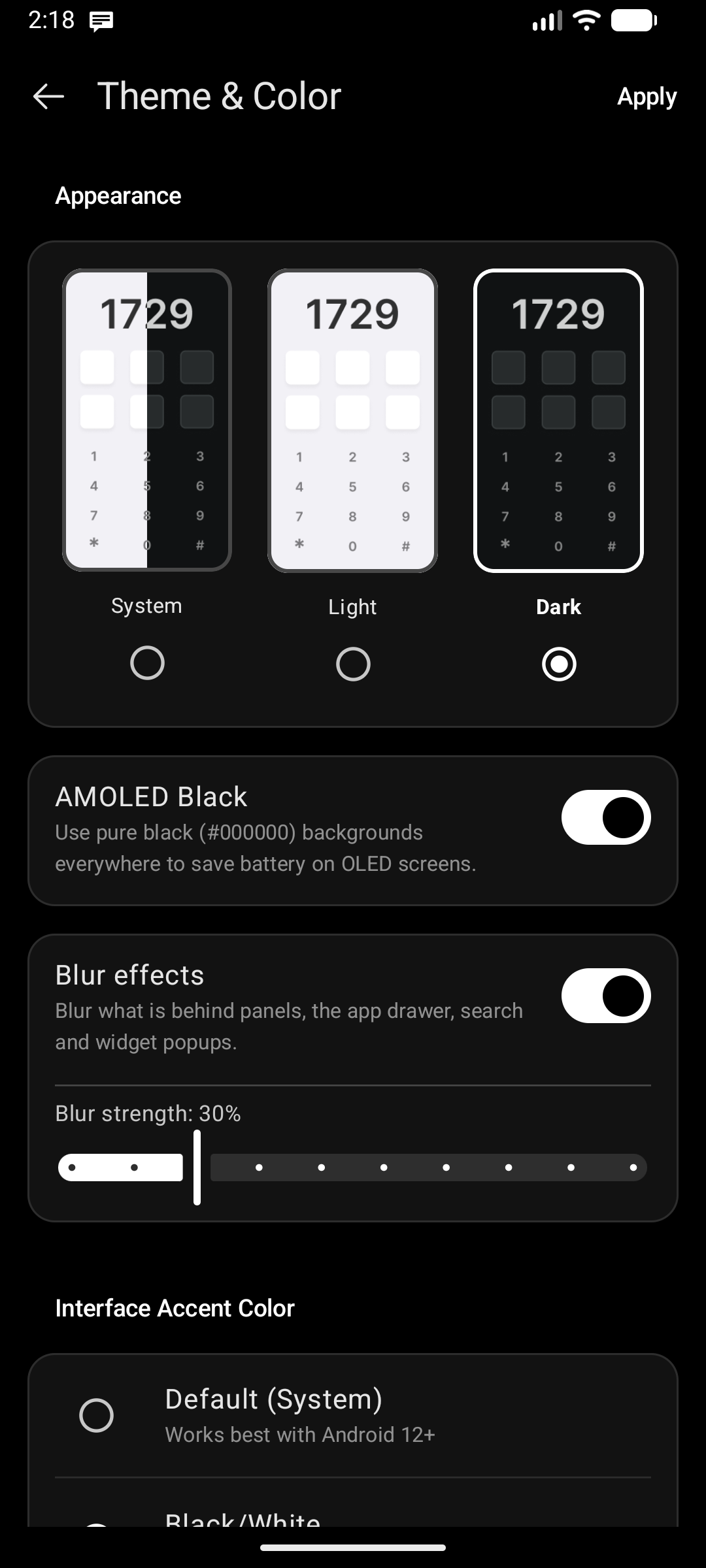
System Theme & Accents
Go to Settings → General → Theme & Color:
- Light / Dark Mode: Supports standard Light, Dark, or system-matching Automatic themes with interactive visual cards.
- AMOLED Black: A toggle that appears when Dark mode is selected. Uses pure black (
#000000) backgrounds everywhere — including settings screens — to save battery on OLED displays and get true-black contrast. - Blur Effects (Android 12+): Renders real-time hardware-accelerated Gaussian blur behind layered panels (Widget Center, Notification Center, App Drawer, and popup dialogs). Fine-tune the blur strength slider from subtle depth to heavy frosted glass.
- Interface Accent Color: Choose your preferred accent color for highlights, active switches, buttons, and progress indicators: Default (System) Material You palette, Black/White, or a Custom Color.
Wallpaper Customization
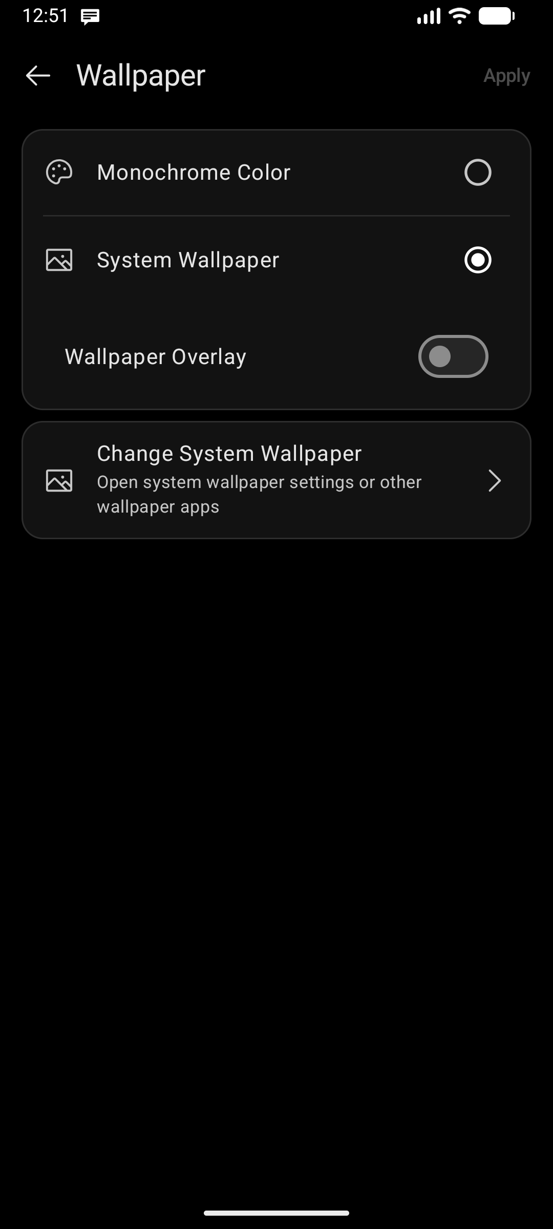
Go to Settings → General → Wallpaper Configuration:
- Darken Wallpaper & Custom Overlay Color: Choose custom overlay colors and opacity layers over your wallpaper, guaranteeing high text contrast over bright or complex backgrounds.
- Monochrome Color or System Wallpaper: Select a solid minimalist color or inherit your device's wallpaper.
- Change System Wallpaper: Quickly launch system wallpaper settings or third-party wallpaper apps.
Material You Overlays
On Android 12 and later, the Widget Center, Notification Center, and Discover Feed panels adopt your system's Material You palette, so they blend with the rest of your device instead of using a fixed launcher theme.
Interface Font & Language
The launcher's typeface (including your own uploaded fonts) and its display language live in Settings → General → General Settings. See Fonts & Language.
Status Bar Controls
- Status Bar Visibility: Toggle whether the system status bar (clock, battery icon, signal strength) is replaced by Key Launcher's own compact info pills.
- Hiding the status bar creates a clean, distraction-free environment.
- All status bar options — visibility, which icons appear, their order, vertical position, size, and color — live in the Status bar section of the Quick Glance config screen. See Personalizing the Center Clock → Status Bar.